Cutrone Barbershop
Cutrone is a barbershop in Chicago that's been on the same block since 1973. John Cutrone opened it. His son Antonio runs it now.
When Antonio took over, the shop was holding two audiences at once. The old-school regulars who'd been coming in since his father's day, and the young professionals moving into the neighbourhood who wanted somewhere with character but didn't know Cutrone existed yet. He needed both.
The problem
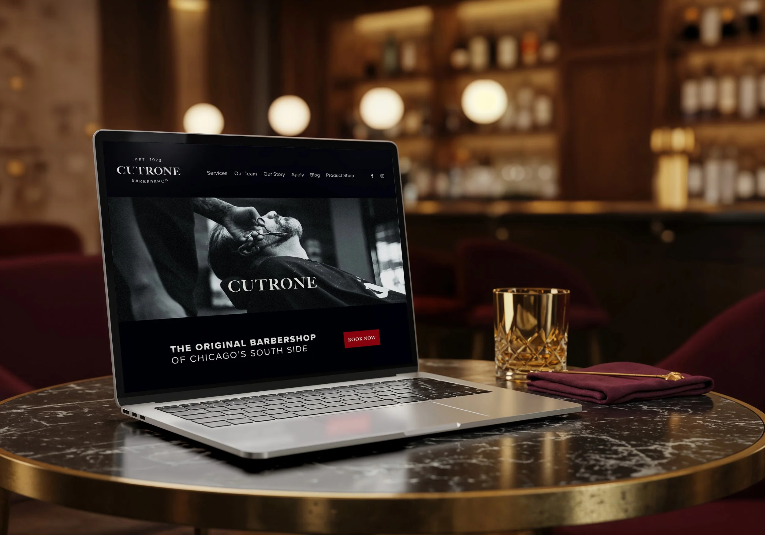
Cutrone had fifty years of craft and zero brand consistency. Ten-plus logos floating around. A dated website. A social feed that looked like five different businesses. The reputation was rock-solid; the brand looked like nothing.
The real challenge wasn't visual, though. Most barbershops bridge one audience or the other. Cutrone needed to bridge both, without compromising for either.
What I did
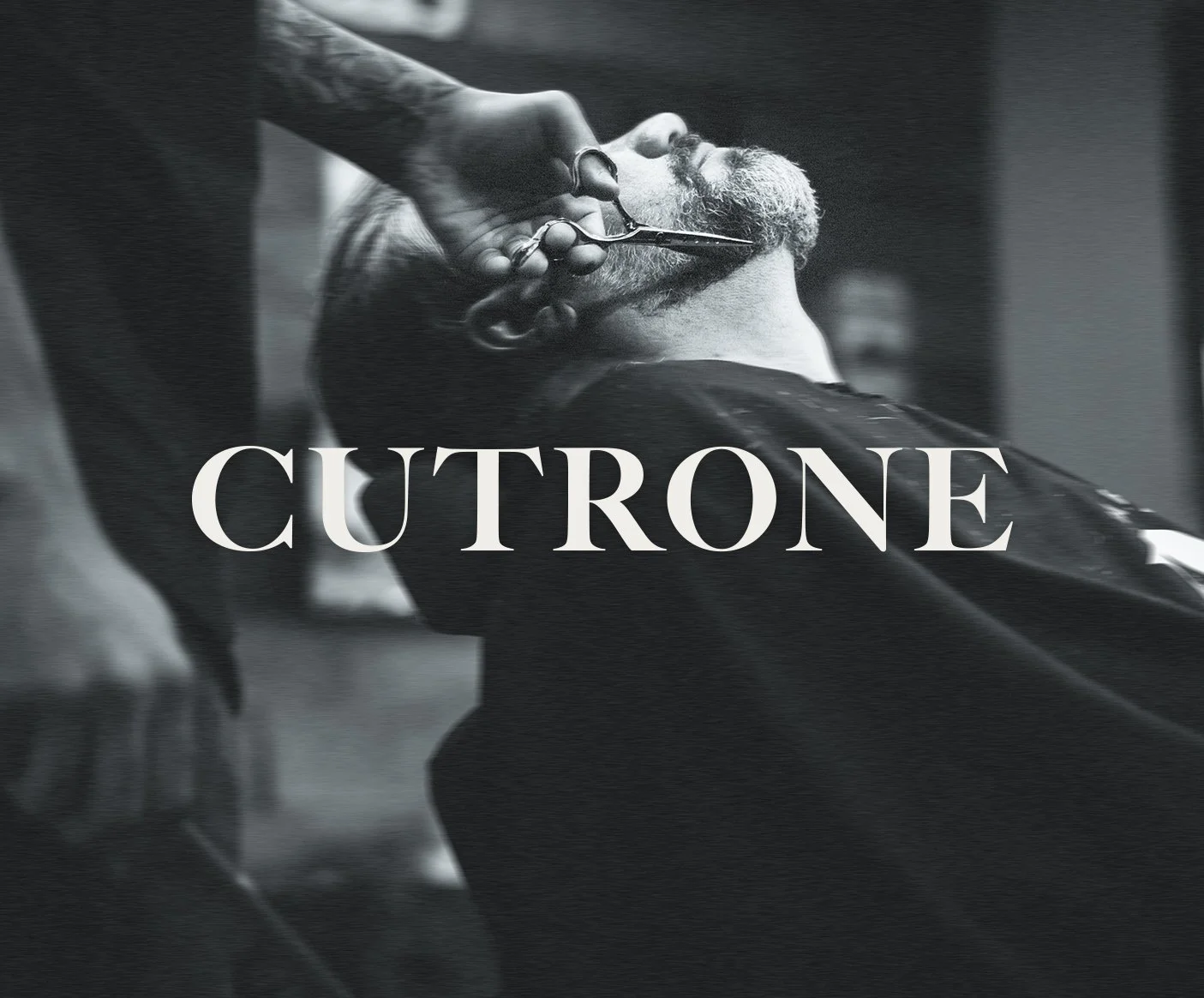
I started by looking at every logo Cutrone had ever used. They drifted in every direction, but they all shared one quality: restraint. Nobody had ever tried to make Cutrone feel loud. The restraint was the through-line. The brand already knew what it was; it just hadn't been said out loud.
Then I looked outside the brief. Old Italian institutions that pulled off the same trick of feeling timeless to one generation and current to another. “The Godfather” aesthetic. Old Roman restaurants. Establishment-coded places that read as authoritative without trying. That's where the visual direction came from.
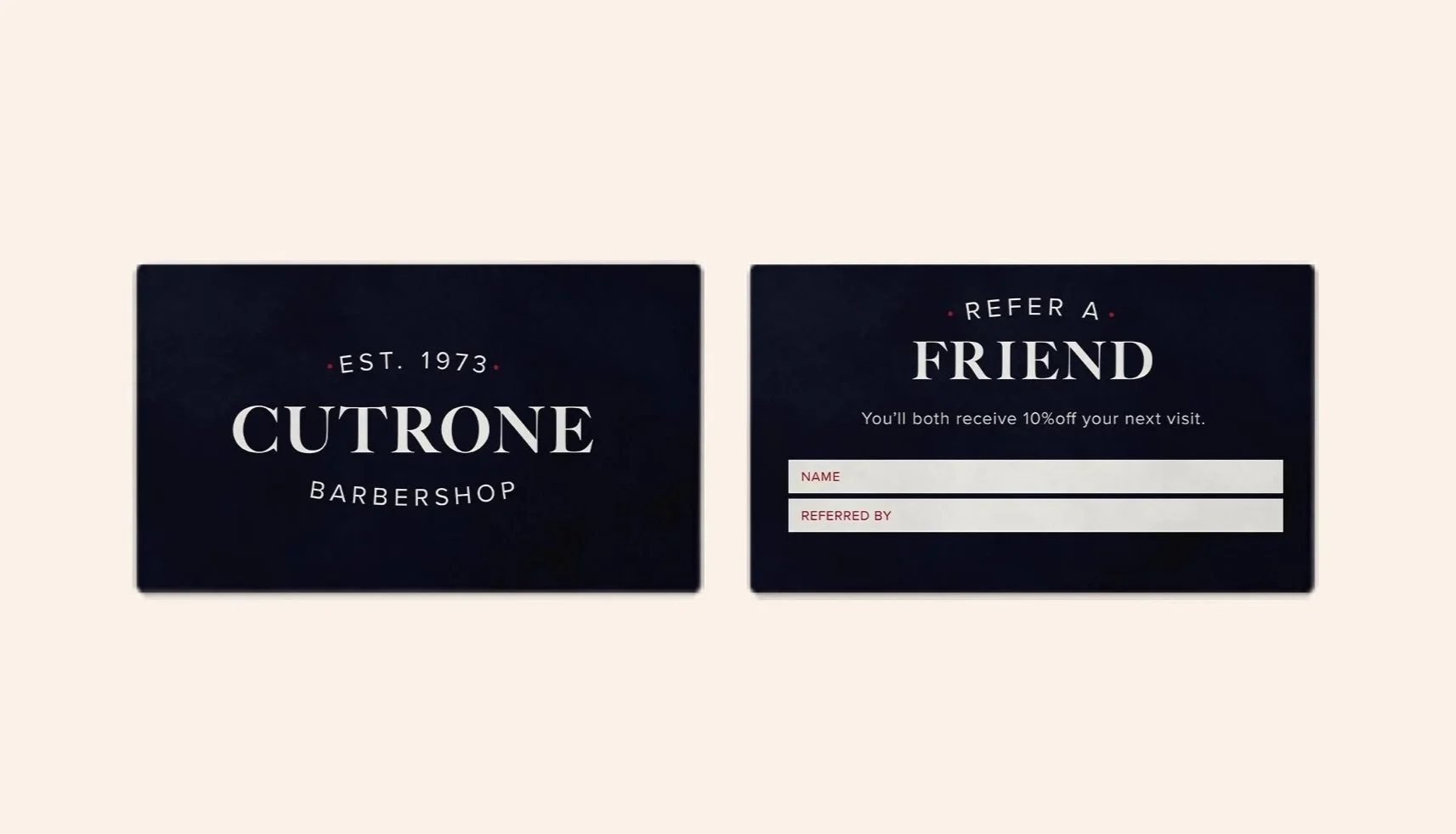
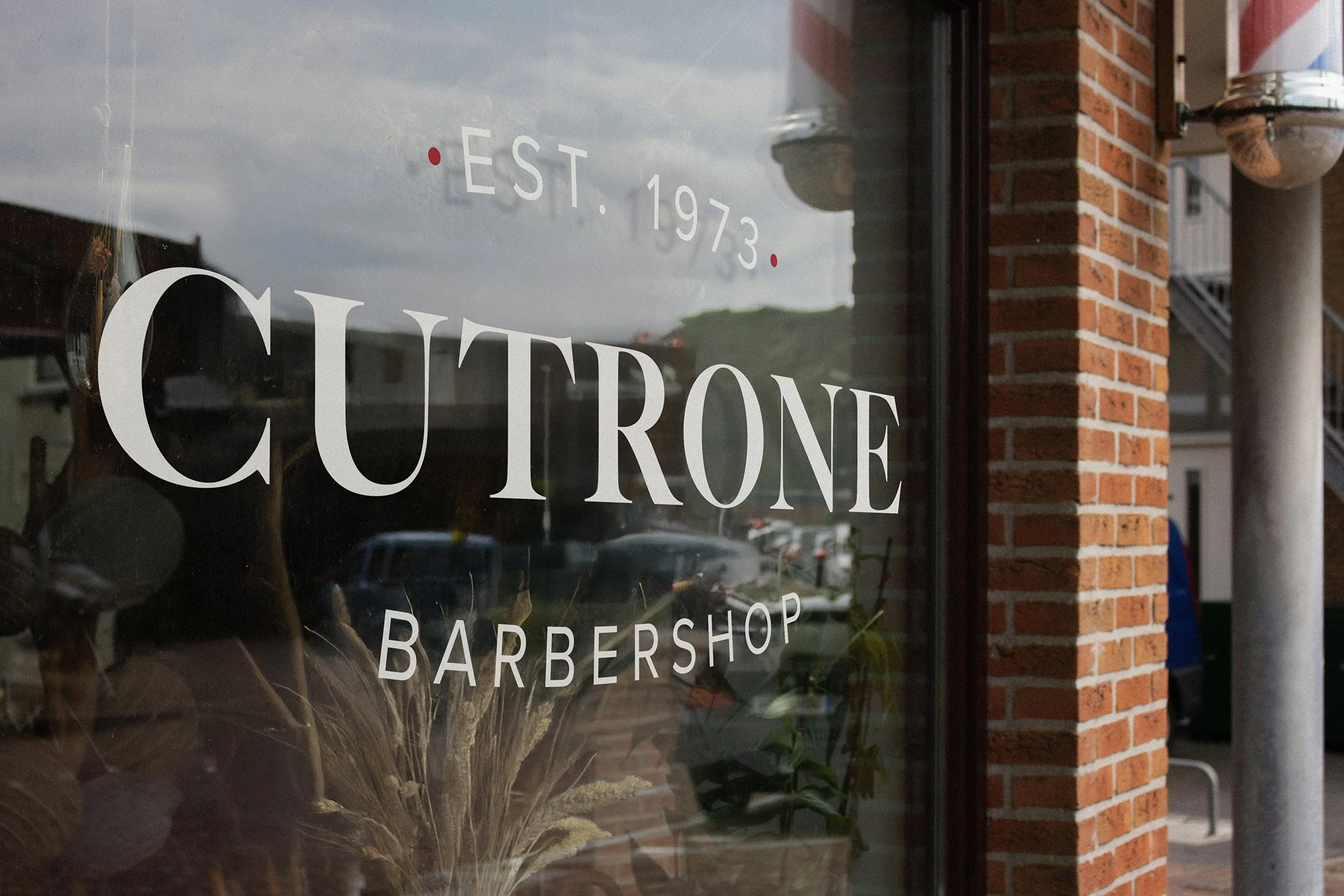
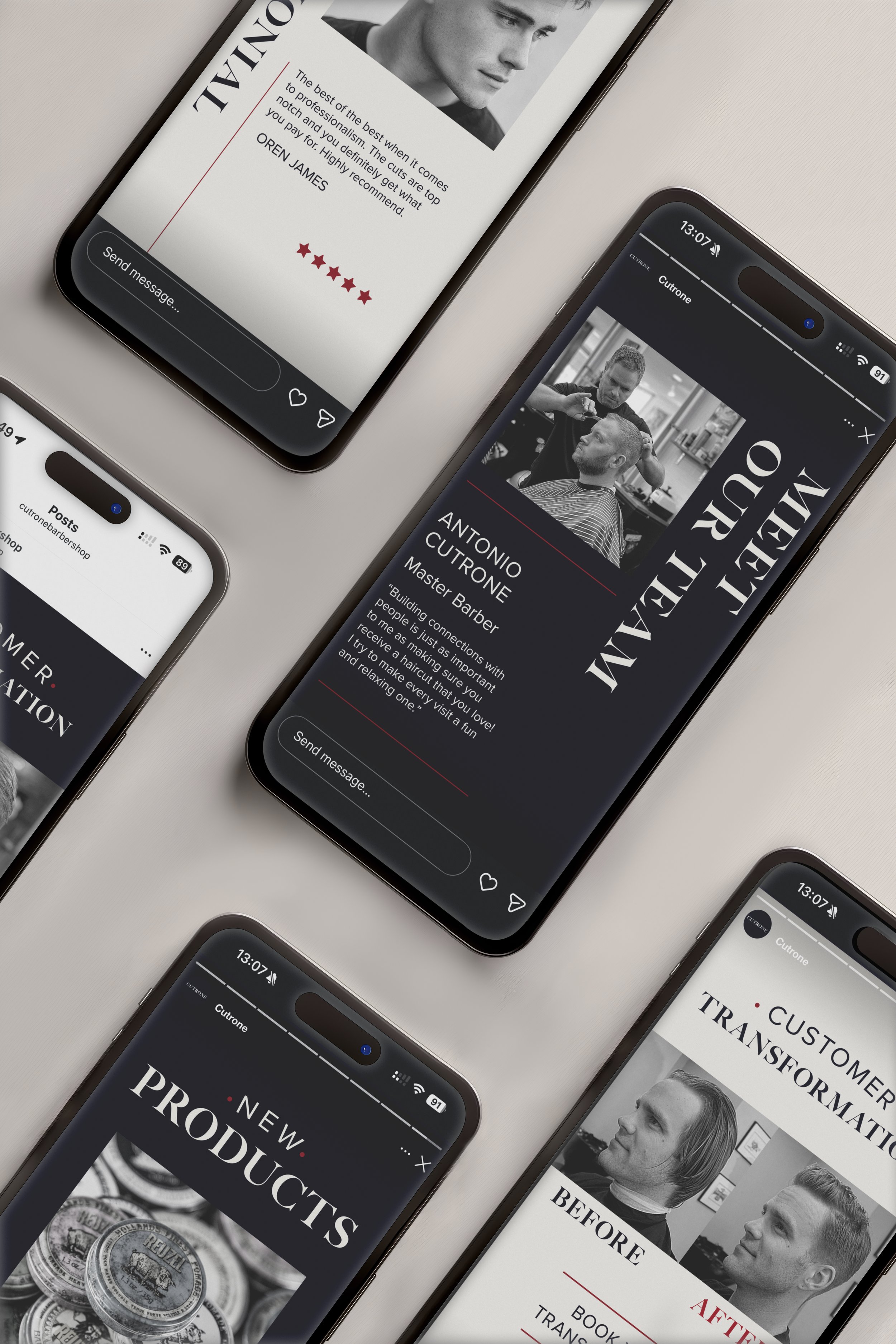
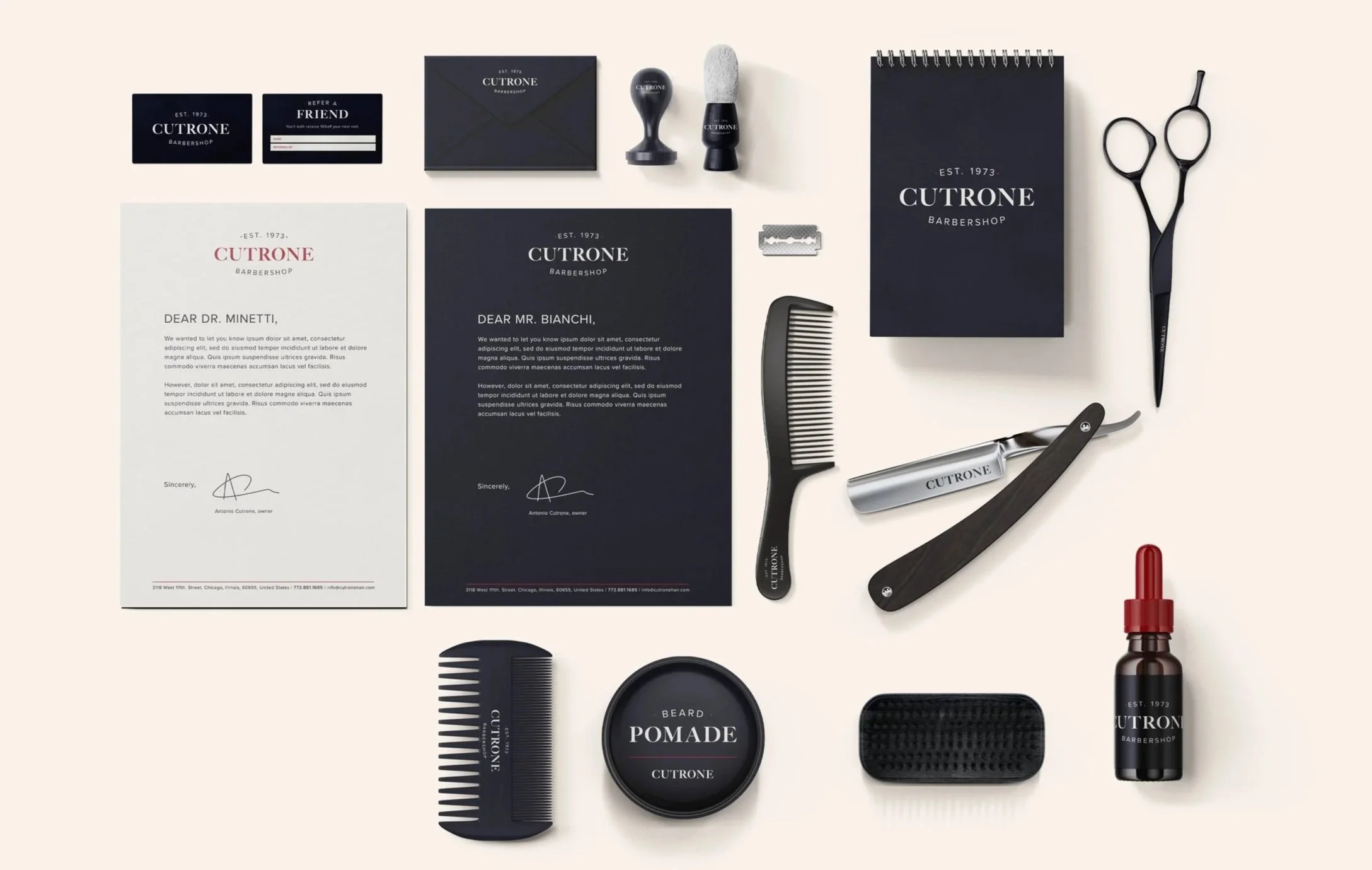
What came out: a wordmark rooted in Italian typographic tradition, a palette built to feel timeless instead of trendy, and a system that could sit on a fifty-year-old storefront without feeling like a gentrification project. Then I rolled it across logo, website, social, and storefront. One voice everywhere.
The result
Cutrone now looks the way it has always felt. One brand, one voice, across everything.
Built to carry the next fifty years.