Gypsy Vina
Gypsy Vina is a natural wine brand making something unusual: a playful, accessible take on a category that usually positions itself as either austere or precious. The founder came to me with a real product, real momentum, and a brand that wasn't keeping up.
The problem
The product was good. The brand wasn't reflecting it.
The packaging looked homemade. In a category already crowded with intentionally artsy labels, that wasn't differentiation, it was disappearing.
There was also a strategic question hanging over the project. The founder wasn't sure whether the name Gypsy Vina was right. He thought it might be too unconventional. We tested it against the target audience and found the opposite: the name was creating exactly the energy the brand was built around. He just hadn't trusted it yet.
The real challenge was making the brand feel experimental without feeling messy.
What I did
I started by clarifying the audience. Not natural wine drinkers generally, but a specific subset: taste-first early adopters, the people who go looking for obscure, conversation-starting bottles before everyone else discovers them. That audience doesn't want polish. They want a brand that signals discovery.
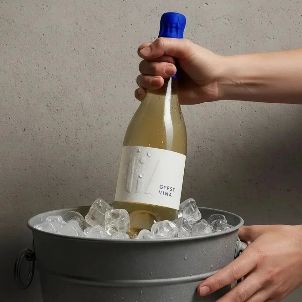
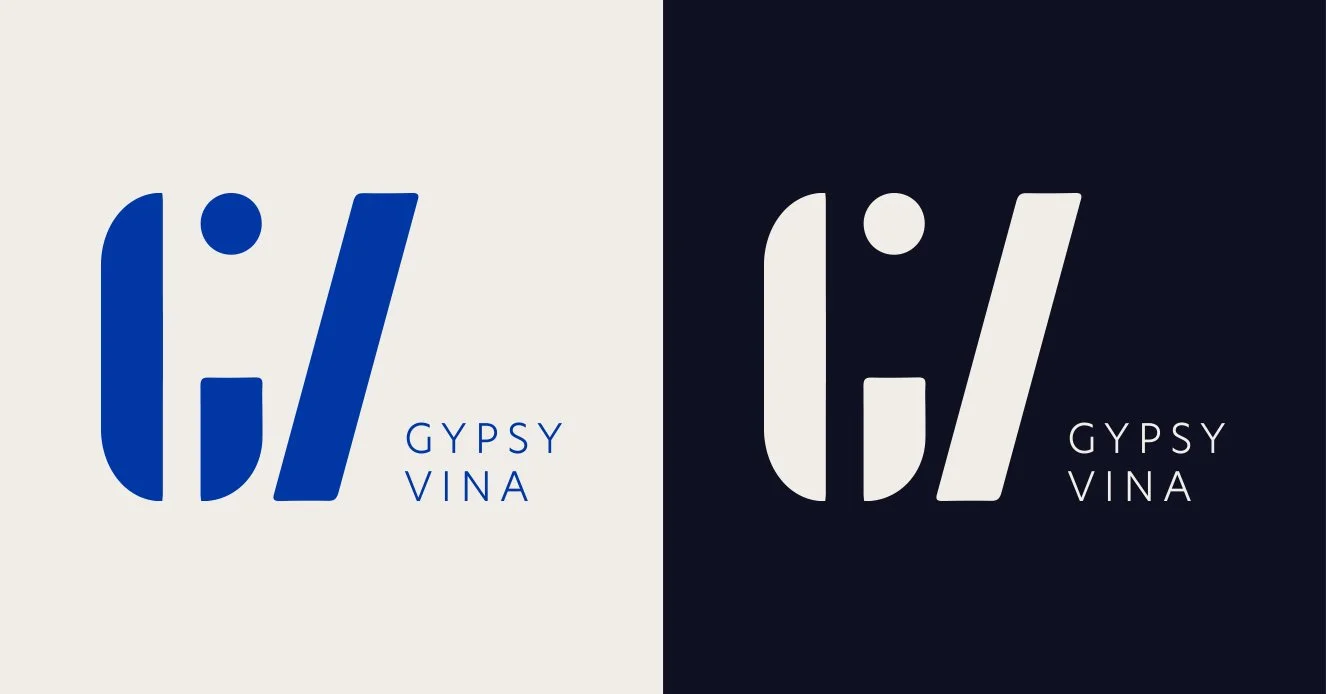
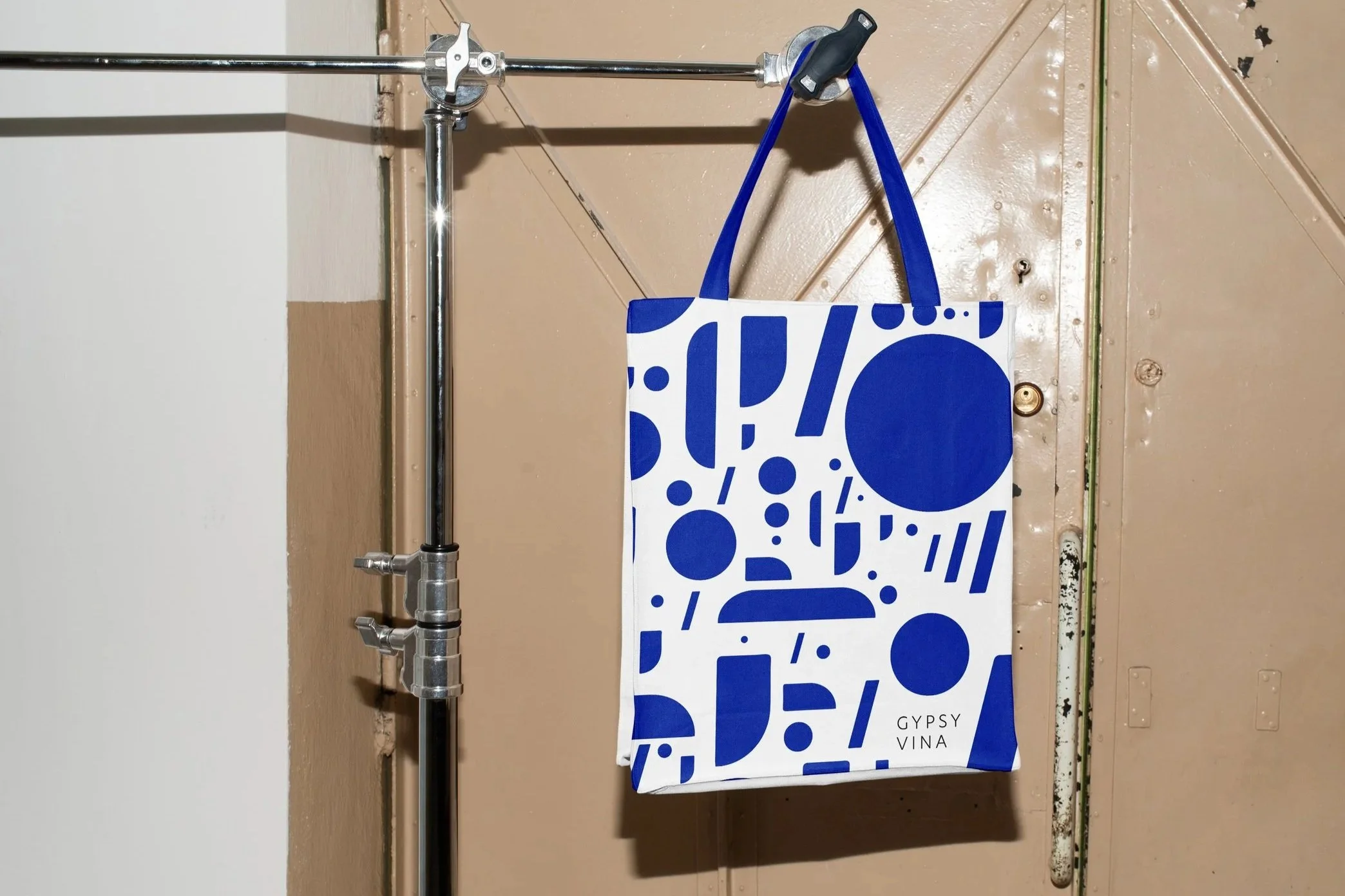
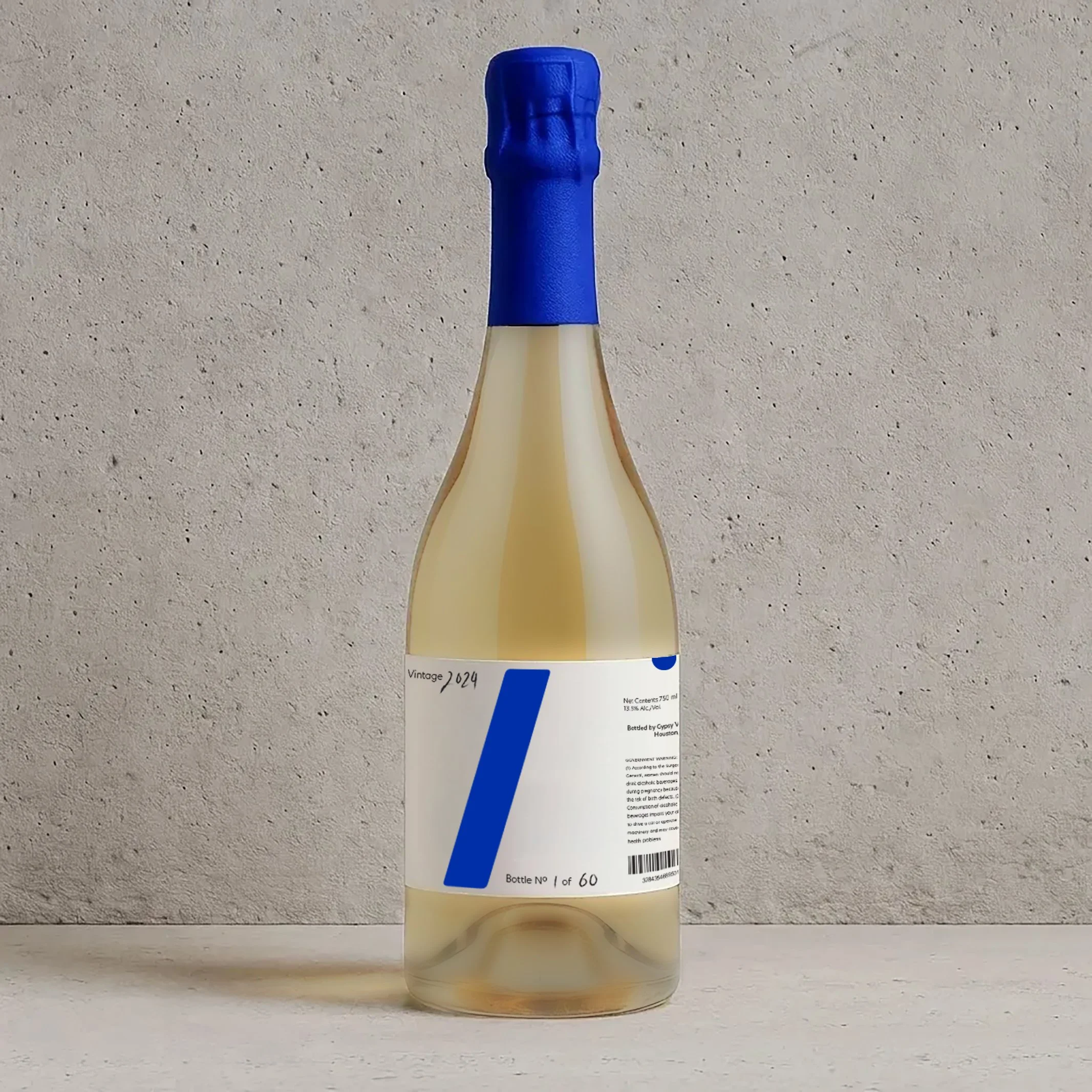
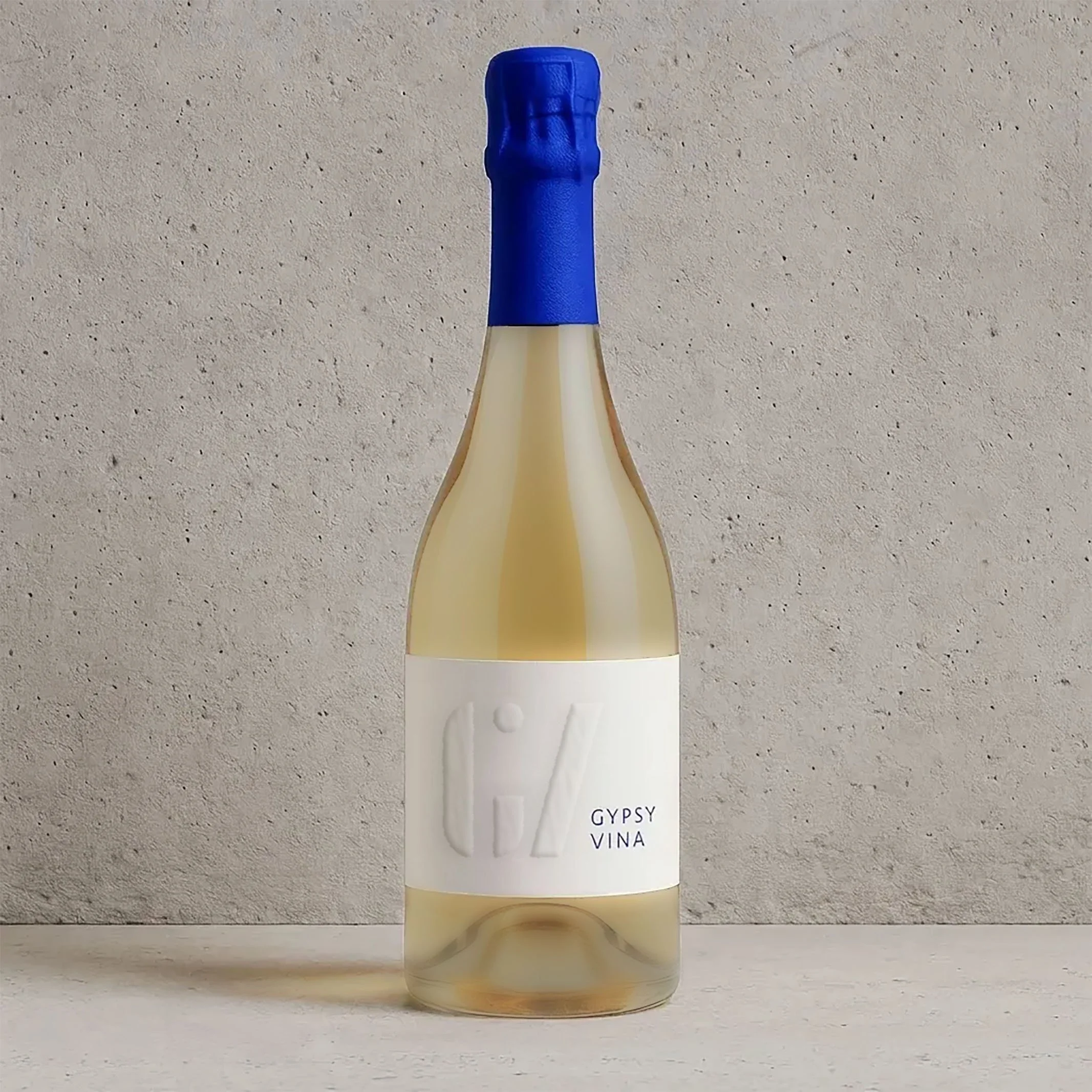
Then I built a visual identity that felt intentional instead of homemade. We balanced playfulness with restraint and avoided every natural wine cliché I could name: handwritten labels, deliberately bad illustration, the whole garage-producer aesthetic the category leans on by default. We incorporated the founder's love of contemporary art into the visual language, in a way that felt modern and eye-catching on shelf without overstating itself.
The bottle's seal is custom-designed duct tape in Yves Klein blue. The reference goes two ways. The founder sealed his earliest bottles with actual duct tape when he was brewing at home, so the new design preserves the brand's homemade origin instead of erasing it. He's also a serious street art and skateboard art collector, and duct tape lives in that visual language too. The result is a packaging element that looks accidental but isn't, and does more work than any logo could to signal where the brand actually comes from.
The result
A brand that matched the originality of the product itself.